

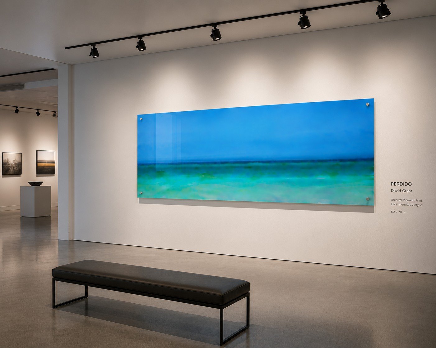
 Image 1 of 6
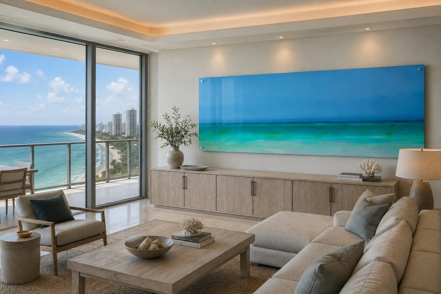 Image 2 of 6
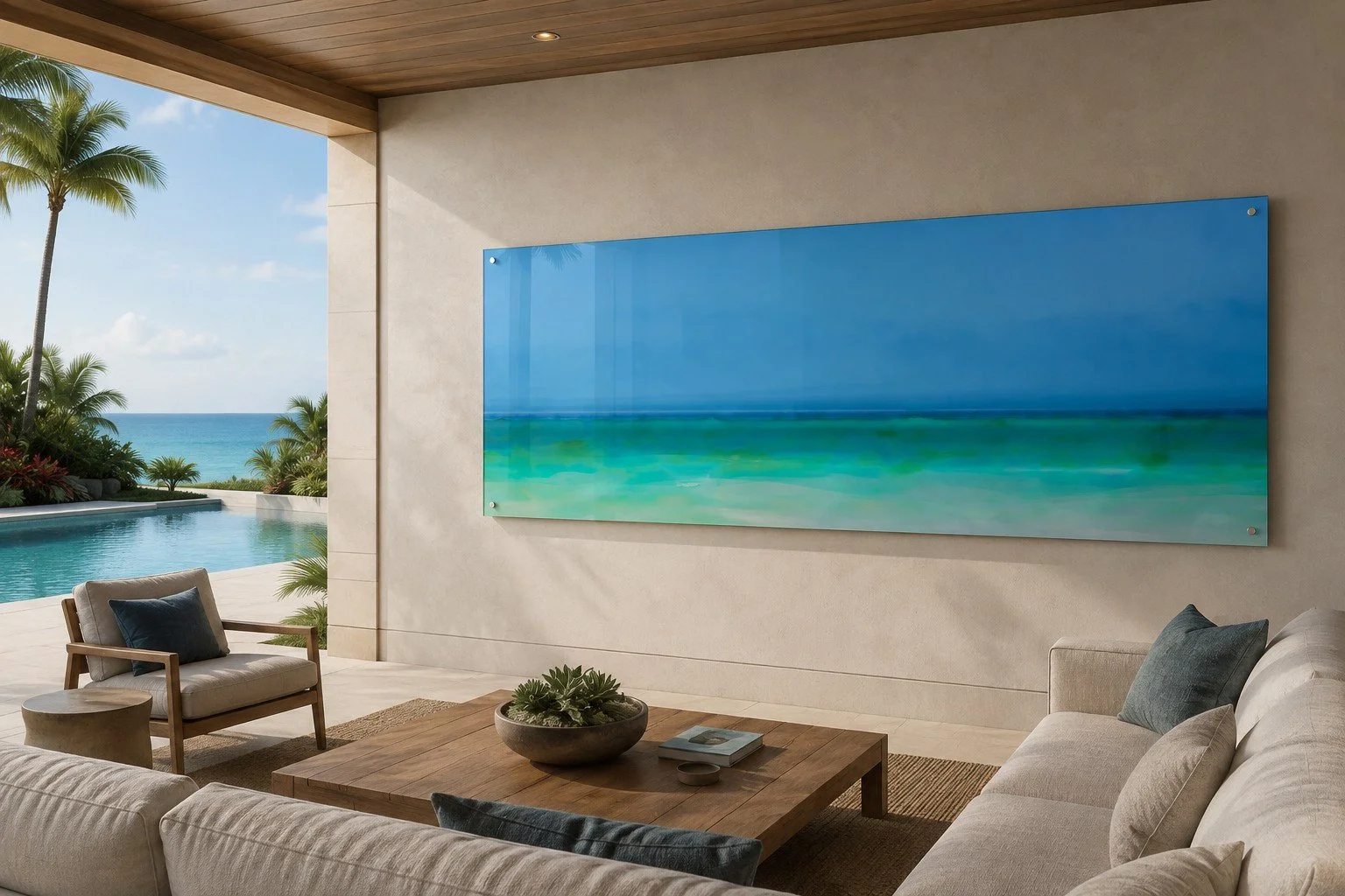 Image 3 of 6
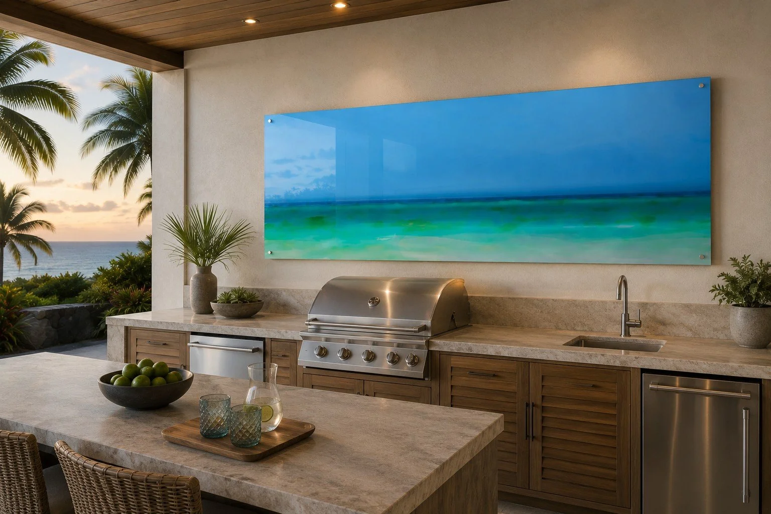 Image 4 of 6
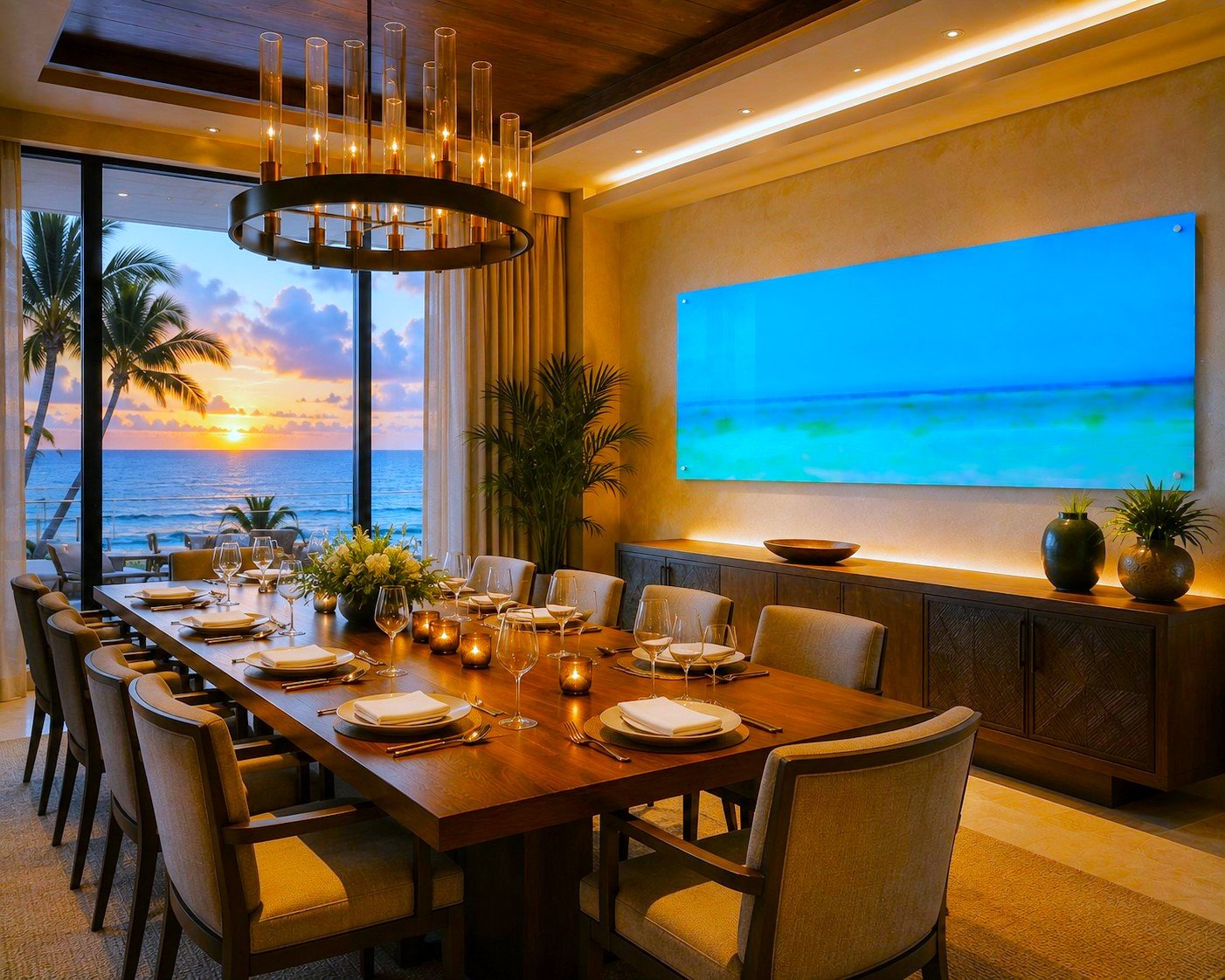 Image 5 of 6
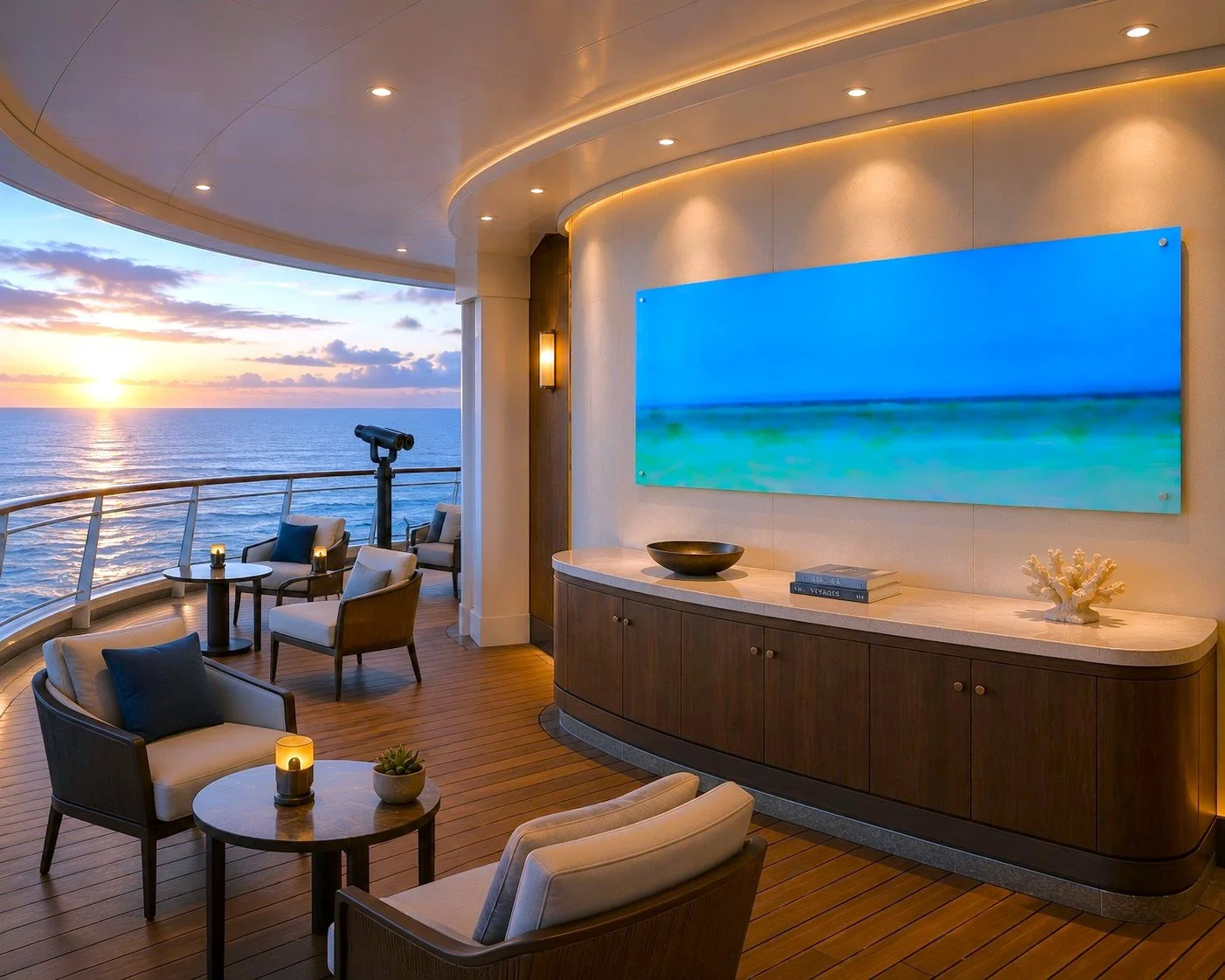 Image 6 of 6
Size Recommendation
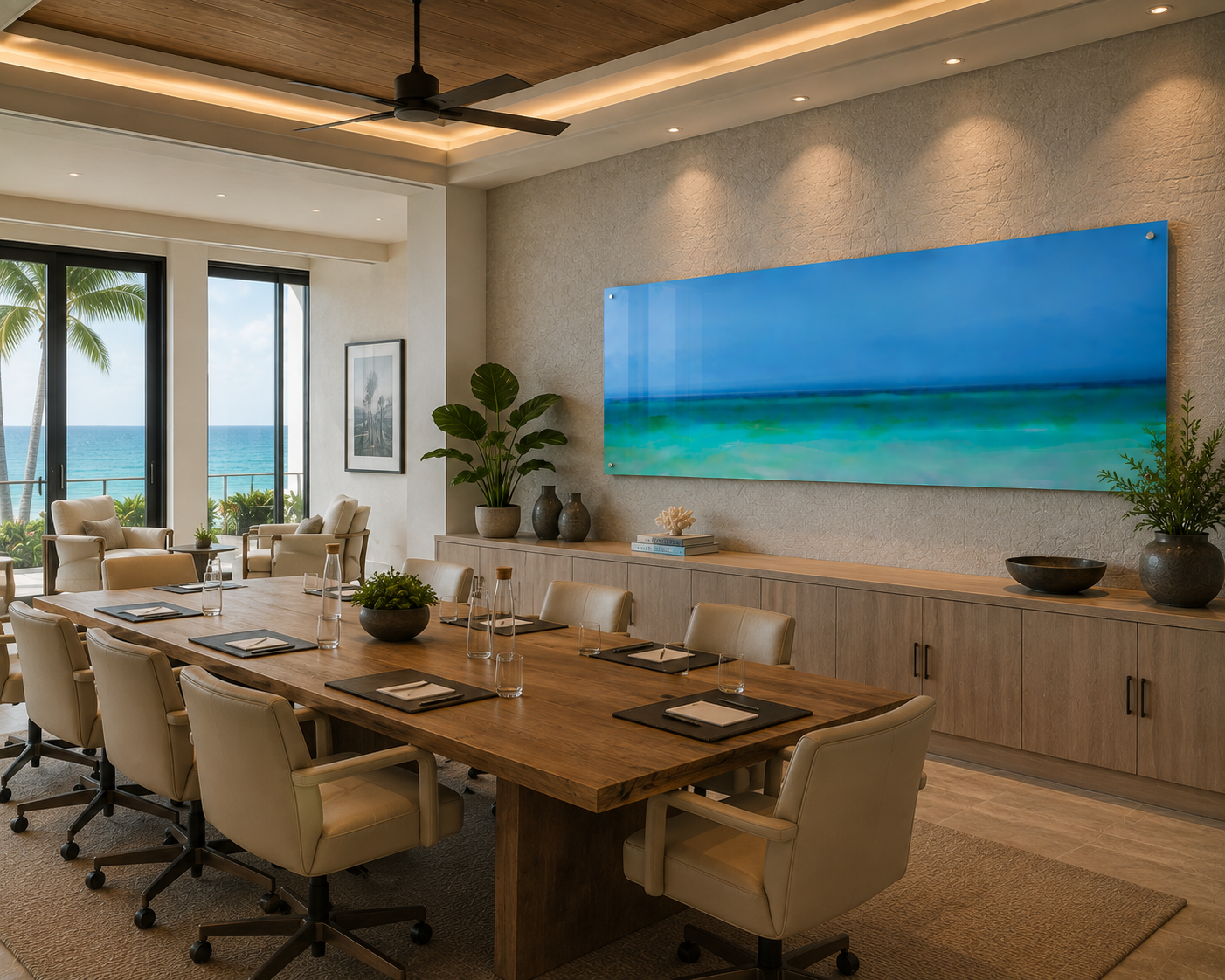
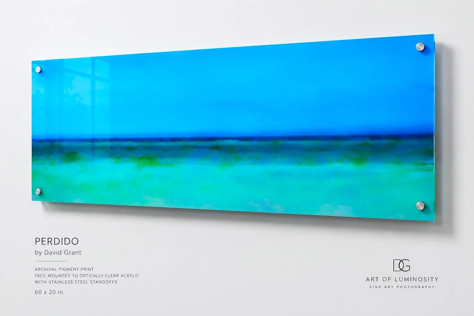
Primary size: 60 × 20 inches — my strongest recommendation.
Secondary: 48 × 16 inches — excellent for guest rooms, smaller living spaces, and narrower walls.
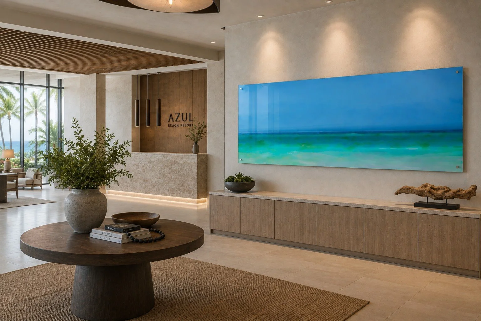
Statement size: 72 × 24 inches — appropriate for larger hospitality spaces, long corridors, resort lobbies, or above a substantial sofa.
I would not go smaller than 36 × 12 inches.
I'd probably list 60 × 20 as the signature presentation, with 48 × 16 and 72 × 24 as alternatives.
Frame Recommendation
Frameless clear acrylic — strongest
Thin dark brown Alder, no mat — excellent alternative
Thin matte-black frame, no mat — good, but more conventional
Recommended lighting
Color temperature: 3000–3500K
This gives you a clean, sophisticated white without making the blue tones feel cold.
CRI: 90+, preferably 95+
This is especially important for the subtle cyan, turquoise, and blue transitions.
Beam: 24–36° narrow/medium flood
You want controlled illumination across the long horizontal piece rather than a concentrated spotlight.
Position: Mount the light above the artwork and slightly forward, aimed downward at roughly 25–30°. For a 60 × 20" piece, I would use two small adjustable fixtures rather than one powerful light.
Design Tip
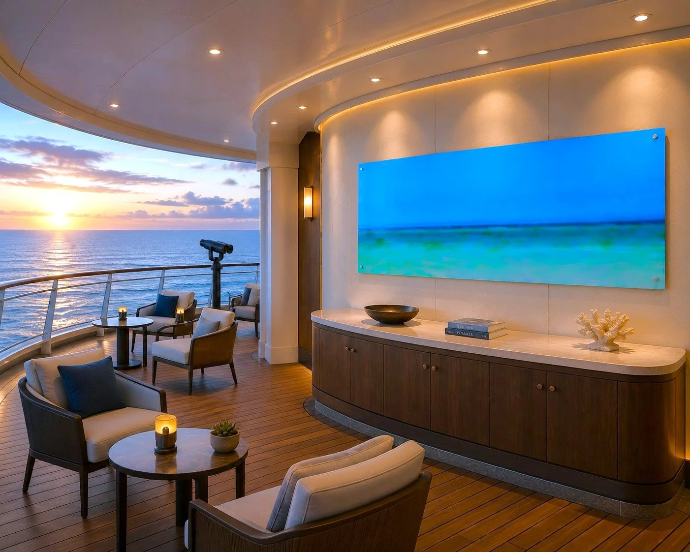
The acrylic presentation is not just acceptable—it may be the ideal presentation for Perdido.
What works particularly well is how the artwork picks up the actual pool and ocean colors without becoming literal. It feels integrated into the architecture rather than decorating it.
I also like the absence of a frame. The clean acrylic edge makes the image feel almost like a window into another place, which is a wonderful quality for this particular work.
And this is exactly why your hospitality focus makes sense. Perdido doesn't merely look good on a wall; it creates an atmosphere for the space.
I would absolutely include an acrylic version in the hospitality presentation.
Special requests for size,framing or design recommendation are invited. Submit Inquiry