

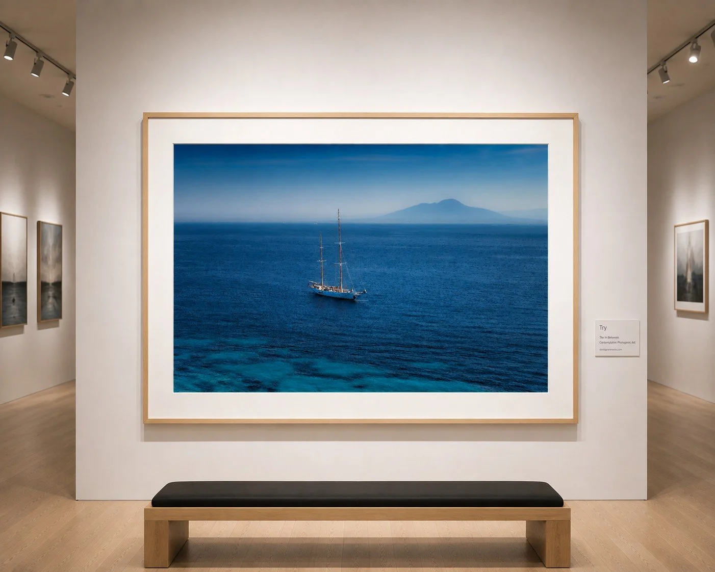
 Image 1 of 6
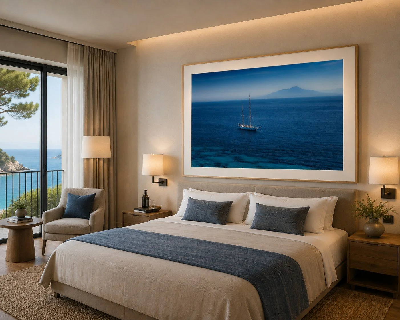 Image 2 of 6
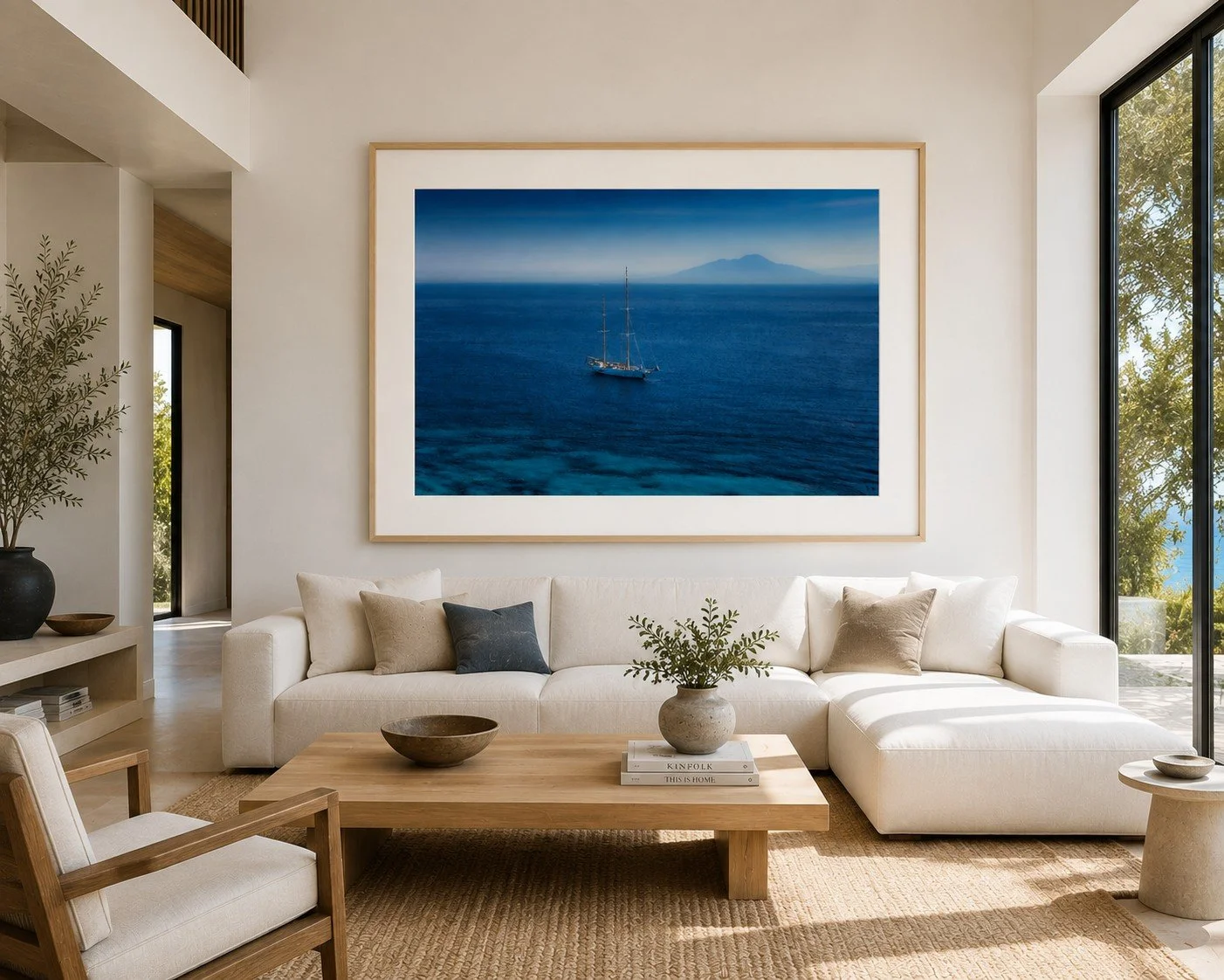 Image 3 of 6
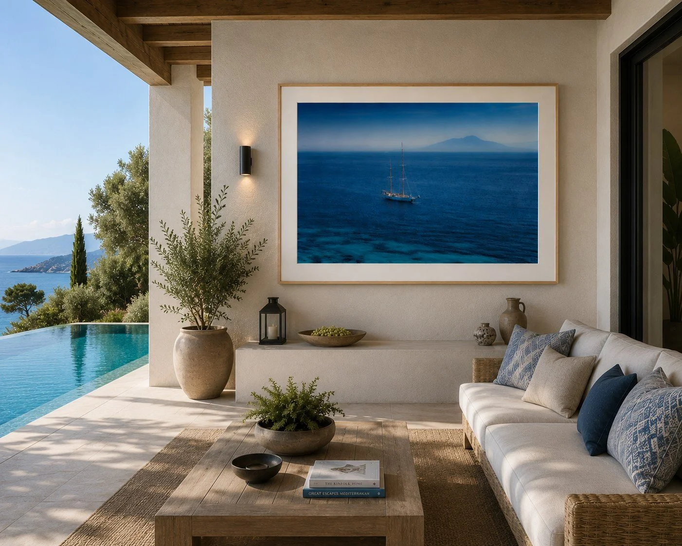 Image 4 of 6
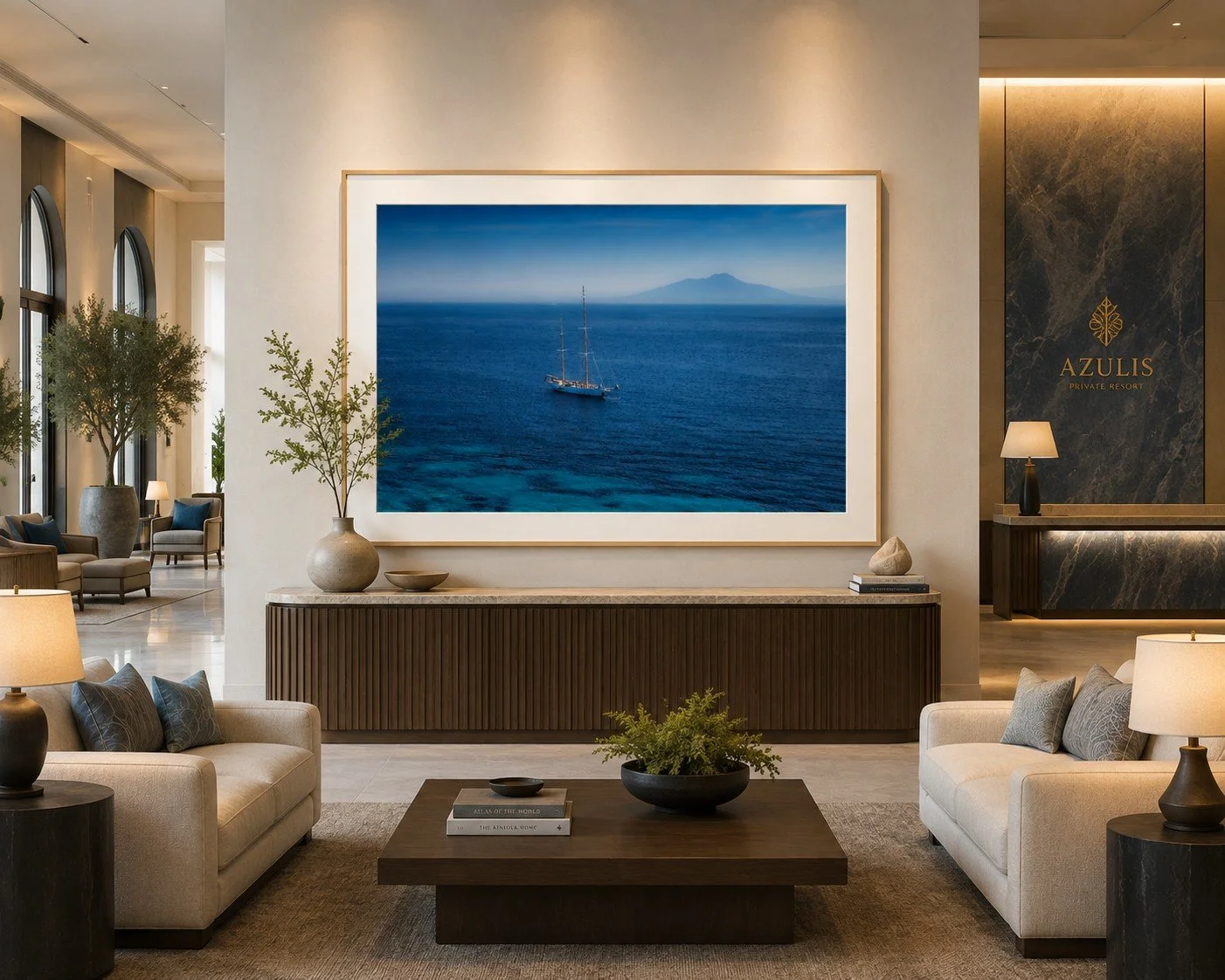 Image 5 of 6
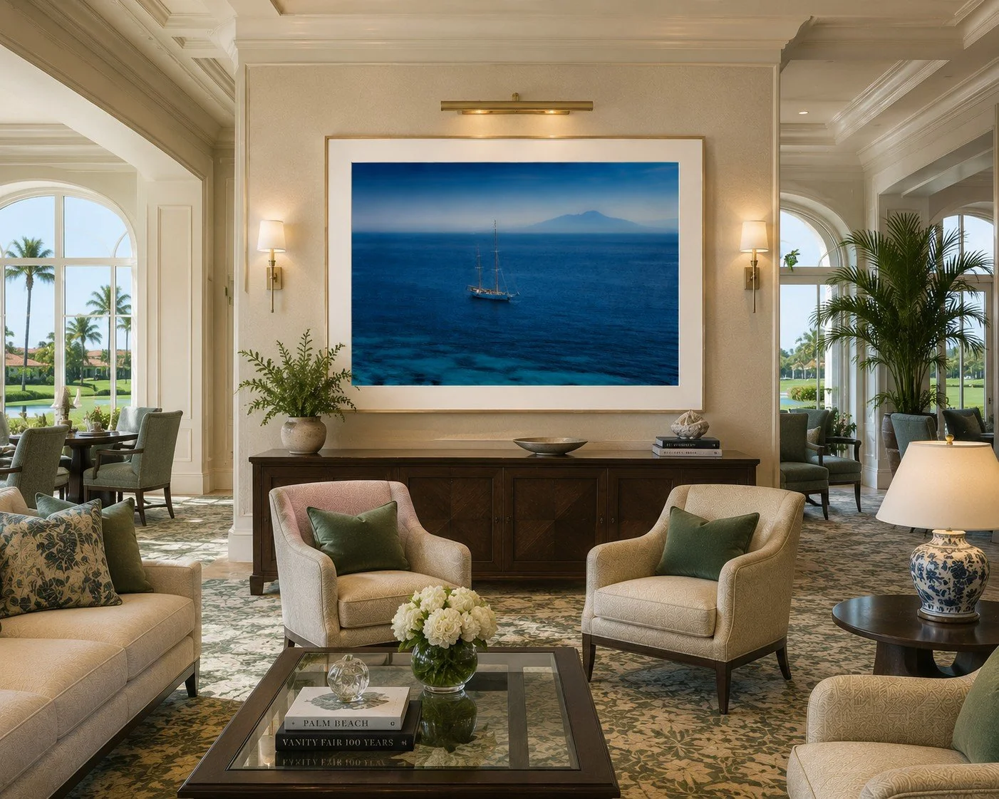 Image 6 of 6
Recommended print sizes
47×35 in. — excellent residential or boutique-hotel size
41×31in. — more intimate placement
37×28 in. — useful for smaller rooms, but I think it gives up some of the image's power
52×39 - larger hospitality option - framed - ready to display
Recommended Frame
A very thin natural maple frame would:
Bring a subtle warmth to all that cool blue.
Echo the warm neutral tones barely present in the distant landscape.
Make the piece feel more Mediterranean and organic rather than strictly contemporary.
Keep the presentation light and open.
Work beautifully in hospitality environments where designers often want natural materials.
Prevent the image from becoming too cool or clinical.
And there's a conceptual fit I really like:
Blue = distance, atmosphere, contemplation.
Maple = warmth, nature, human presence.
That little contrast could make the whole piece feel more alive.
Lighting Recommendation
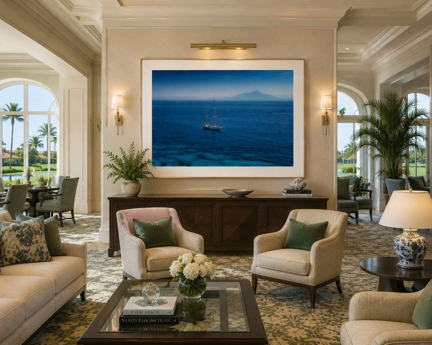
Recommended gallery lighting
Primary: a dedicated, dimmable LED picture light mounted above the frame.
Color temperature: 3000K
CRI: 95+
Beam: broad, even wash rather than a narrow spotlight
Intensity: approximately 50–75 lux at the artwork
Aim the light downward at roughly 30° to minimize reflections and evenly illuminate the print and white mat.
For the minimalist living room
Because the room already has beautiful natural daylight, I wouldn't fight it. Let daylight provide the ambient illumination and use the artwork light primarily after sunset.
Design Tip
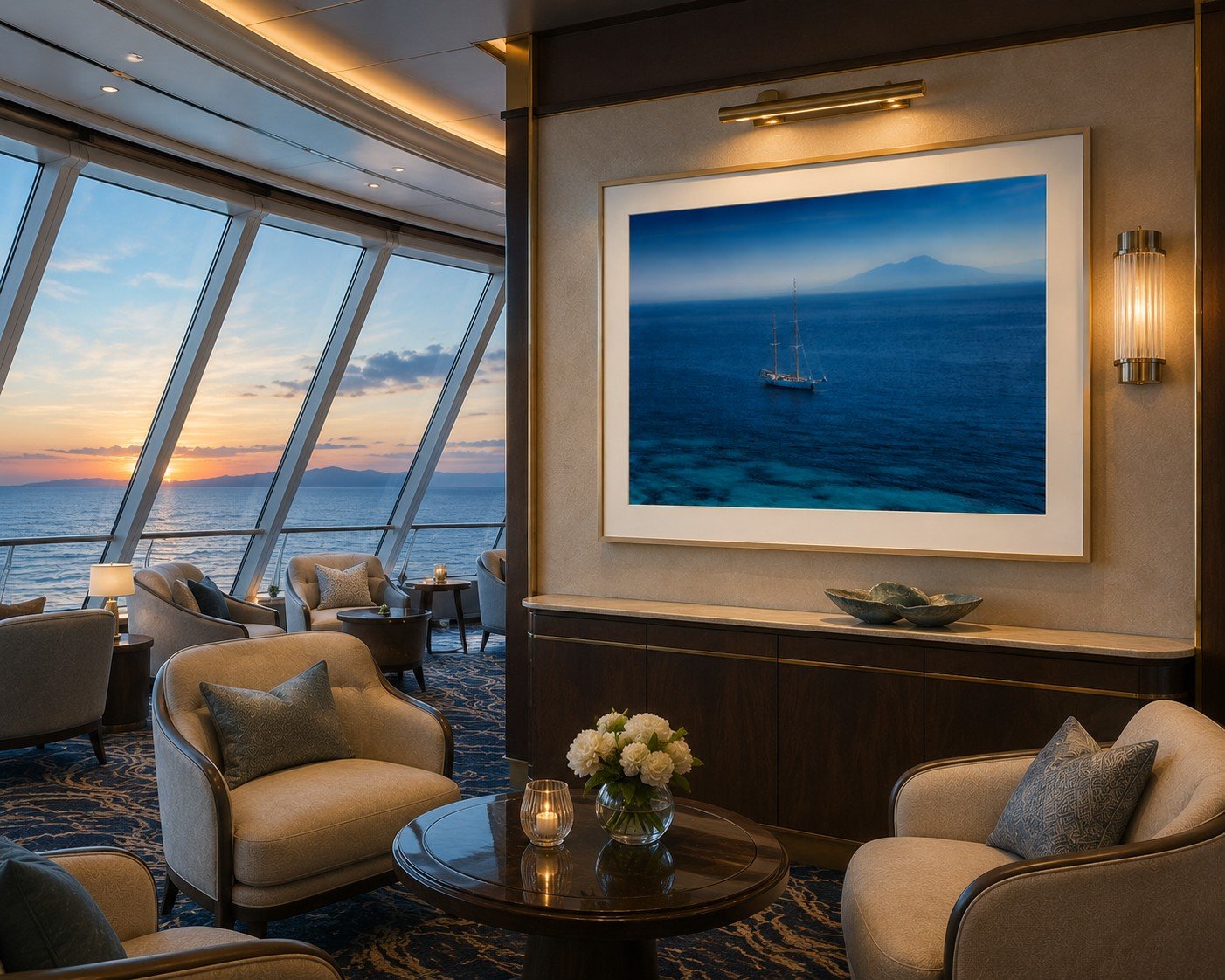
The restrained palette and strong horizontal composition allow Try to bring color and depth to an interior without dominating it. Particularly well suited to boutique hotels, coastal resorts, wellness spaces, guest suites, private residences, and other environments where art is intended to create a sense of calm and visual spaciousness.
Special requests are always welcome. If you have a custom size, framing preference, or a unique project in mind, I invite you to submit an inquiry.
Tear Sheet
Return